You have seen the words. Someone on a forum says a stock is "meeting resistance at 400", or that it "has good support down at 350". An analyst says it on television in the tone of a weather forecast.
Then you open the chart yourself and it is just a zigzag. No line, no 400.
The obvious question is whether they are seeing something you are not, or whether they made it up. Both are a little bit true, and there are measurements that show which part is which.
Why this term before any of the others
If you are going to learn technical analysis, support and resistance is the one to take first. Not because it is the easiest, but because nearly everything else you will hear is built on top of it:
- Breakout means price has gone through a level.
- Retest means it came back to see whether the level holds.
- Range means price is sitting between two levels.
- Double top means it tried the same level twice and failed.
- Breakdown means a level gave way.
Five bits of jargon, and every one of them is a single sentence about a level. Learn what a level is and the rest stops being tribal language.
The previous post covers what technical analysis actually is, if you have not read it.
So what is it?
Support is a price area where buyers have shown up before and stopped a fall. Resistance is the opposite: an area where sellers have shown up and stopped a rise.
That is the whole definition. Ten seconds.
The rest of this is about the part that is actually hard, which is why such areas exist at all, and how well they hold.
Why a level forms
A price remembers nothing. The people around it remember, and that has been measured.
The best known measurement is Terrance Odean's study of 10,000 brokerage accounts from 1987 to 1993. It found a strong tendency to sell the positions sitting on a gain and hold the ones sitting on a loss. The behaviour could not be explained by rebalancing, by the cost of trading cheaper shares, or by the held positions doing better afterwards. They did not.
The textbook name is the disposition effect. In practice it means your purchase price stays a number you are reacting to long after the market has forgotten it.
Say somebody bought at 366 kroner and watched it fall. Months later it is back at 366. Plenty of them sell to get out flat, finally done with it. Meanwhile the people who meant to buy at 366, put it off, and have been annoyed ever since are buying.
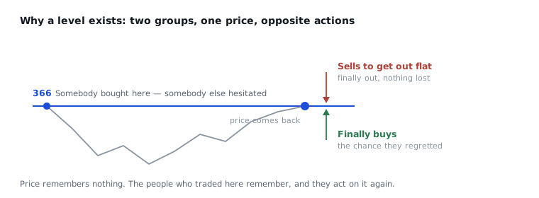
Two groups, same number, opposite actions. That is why anything happens there at all, and why a level gets stronger the more often it is tested: every test leaves more people with a decision attached to that price.
Round numbers, and the orders sitting on them
100, 500, 1,000. Shares stall at round numbers noticeably often, and it is hard to explain with anything about the company.
There is an unusually clean measurement here. Joep Sonnemans used the Dutch stock market from 1990 to 2001 as a natural experiment: from 1 January 1999 prices were quoted in euros, while people still had guilders in their pockets until 2002. Prices clustered at round numbers, and crossed them less often than other numbers. Real barriers, then.
And the effect followed the currency prices were displayed in, not the numbers people had carried in their heads. The barrier is not the market remembering a particular amount. It is that the number on the screen looks round.
Why that works, somebody has seen directly. Carol Osler obtained the complete order book of the Royal Bank of Scotland from 1 August 1999 to 11 April 2000: 9,655 stop-loss and take-profit orders with an aggregate face value over $55 billion, across three currency pairs. Almost 10% sat at rates ending in 00, against about 3% at each of the other rates ending in 0.
But the finding that matters is how they sat:
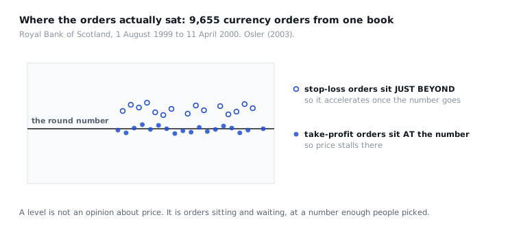
Take-profit orders sat at the round numbers. Stop-loss orders sat just beyond them. In price that is a negligible difference. In consequence it is not.
Price stalls at the level because there are orders there taking profits. And once the level does go, the move accelerates, because it immediately runs into a cluster of stop-loss orders that fire more trades in the same direction.
So put your stop just beyond the round number and you have put it exactly where everybody else put theirs.
When a level breaks, do not delete it
If there were room for only one rule in the whole field, it would be this one.
Resistance that gives way becomes support. Everyone who was standing around waiting to get in now has a number they know well, and it is underneath them. If price falls back to it, they buy. It is cheap again.
Same thing the other way. Break support and it becomes the ceiling everyone who got trapped is hoping to get out at.
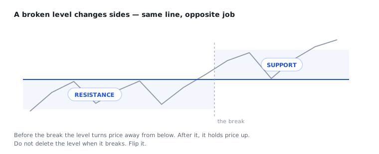
The textbook term is change of polarity. The term is not necessary. The habit is: when a level breaks, leave the line where it is.
But does it work?
This is where it gets uncomfortable. It is the part most people skip, and the part that matters most if you are new.
Osler tested in 2000 whether the levels actually predict, using support and resistance levels that six firms were handing to their own customers. The levels did help predict when an intraday trend would be interrupted. But the strength varied a lot, both across currencies and across the firms that drew them. Something, then, but uneven.
Shares have a longer record, and it is less comfortable. Brock, Lakonishok and LeBaron tested simple technical rules in 1992 on the Dow Jones from 1897 to 1986, and one of them was precisely a break of support or resistance. They found a clear effect.
Then came Sullivan, Timmermann and White in 1999. They widened the set of rules considerably and corrected for what is called data-snooping: test enough rules against the same data and some of them always look good. After the correction, measured on the decade that followed, profitability was small.
The honest summary is this: that the levels exist is well documented. That you can make money from them is not.
And what they do not do
They predict nothing.
A level tells you where orders are sitting, and where people have made a decision before. That is all. Nothing about next week, nothing about how far a move can run, and nothing about which way the level eventually breaks.
Levels break all the time. It is a perfectly normal thing for them to do.
That is probably why a lot of people end up disappointed by technical analysis. They were expecting a forecast and they got a map.
A map is not nothing, though. What you get is a price you can decide on in advance: this is where you find out you were wrong.
Sources
- Terrance Odean, *Are Investors Reluctant to Realize Their Losses?*, Journal of Finance, 1998. 10,000 accounts at a discount brokerage, 1987–1993.
- Joep Sonnemans, *Price clustering and natural resistance points in the Dutch stock market: A natural experiment*, European Economic Review, 2006. The Netherlands 1990–2001, and the switch from guilders to euros.
- Carol L. Osler, *Currency Orders and Exchange Rate Dynamics: An Explanation for the Predictive Success of Technical Analysis*, Journal of Finance, 2003. The Royal Bank of Scotland order book, 9,655 orders.
- Carol L. Osler, *Support for Resistance: Technical Analysis and Intraday Exchange Rates*, FRBNY Economic Policy Review, 2000. Levels from six firms.
- William Brock, Josef Lakonishok and Blake LeBaron, *Simple Technical Trading Rules and the Stochastic Properties of Stock Returns*, Journal of Finance, 1992. Dow Jones 1897–1986.
- Ryan Sullivan, Allan Timmermann and Halbert White, *Data-Snooping, Technical Trading Rule Performance, and the Bootstrap*, Journal of Finance, 1999. The correction to the study above.
The figures are taken from the abstracts and published papers, not from someone else's summary of them.