There are two camps, and they are not especially polite about each other.
One says a share price is just what the company is worth, and everything else is reading tea leaves. The other draws lines on charts and talks about resistance and breakouts. If you are new, you have probably met both and wondered which one is having you on.
I am not going to settle that argument here. But there is one fact inside it that rarely comes up, and it decides quite a lot.
You are already looking at the chart
A 2025 study measured what retail investors actually do before they trade, by looking at the browser history of 484 households. The median was about six minutes of research per trade. And the page they spent most of it on? The price chart. Then analyst opinions. Risk statistics were barely opened.
Six minutes. On a decision involving real money.
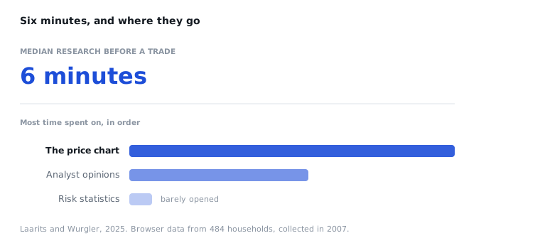
One honest objection before you take that number anywhere: the data was collected in 2007. The paper is new, the behaviour may not be identical today, and I have not found anyone who has measured it again on fresh data.
That is not a criticism. People have jobs and children and a life, and nobody is sitting with an annual report on their lap on a Tuesday evening in November. But it means the question "should I use technical analysis?" is the wrong one.
You are already looking at the chart. The choice is whether you read it with something resembling a method, or on instinct.
What it actually is
Technical analysis means using price and volume, meaning what people have actually paid and how many of them traded, instead of the accounts.
Fundamental analysis asks what the company is worth. Technical analysis asks what people have been willing to pay, and where they changed their minds.
That is all it is. Everything else is methods for answering that second question without fooling yourself.
And here is the part nobody says out loud
Technical analysis does not predict the future.
I mean that literally. There is no line, no pattern and no indicator that tells you what a price will do next week. If somebody shows you a formation and says "this one is going up", they are selling you confidence.
It is worth saying early, because it is where most people end up disappointed: they read a book, drew a triangle, waited patiently for the breakout the book promised, and then the price went the other way without having read the book. The conclusion was that the whole field is nonsense.
But the field never promised a forecast. The book did.
What it is genuinely good for
Three things, and they are less exciting than a prediction:
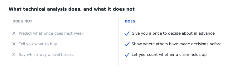
It gives you prices you can decide about in advance. Before you buy anything you can say: if it goes below this number, I was wrong, and I am out. Very little in finance is that concrete, and it is worth more than people think.
It makes visible where other people made decisions. A price that stopped in the same place three times tells you something about where buyers and sellers are sitting. Not what they will do next time. Just that they were there.
It lets you check yourself. A level can be counted. Either price has broken through it seven times or it has not. That is one of very few things in investing where you can test your own claim without waiting a year.
What the research says, and it is uncomfortable reading
This is the part I think most people skip, and it matters most if you are new.
It has been measured, repeatedly and in several countries, that retail investors lose money trading whatever happens to be most visible right now.
Four researchers went through Robinhood data from 2018 to 2020 and looked at the stocks the most users bought each day. On the day itself they rose an average of 14%. Over the next twenty days they gave back 4.7%.
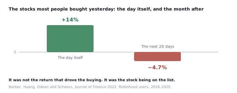
It was not the return that drove the buying. It was the list.
The same pattern shows up in Nordic data. On Nasdaq Helsinki, across ten years of trade-level records, household selling rises by around 21% when a share sits at its high for the year. The authors conclude that households lose out on it while the other side of the trade gains.
So is attention always harmful? No, and this is where it gets interesting. A study of actual brokerage accounts found the opposite: the investors who paid closest attention did better, not worse.
I think the difference is in who decided what you would look at. You, because you were already following the company, or a list that ranked today's moves and put one of them at the top of your screen.
That is an interpretation, not a finding. But it is the single thing I would take away from this whole post.
So should you care?
If you own shares and look at charts, you are doing it already.
The only question left is whether you do it with a method.
If you are a long-term index investor who does not look at prices between contributions: no, probably not. That is a perfectly good way to do it, and nothing here will improve on it.
And if you are looking for something that tells you what to buy, it does not exist, not here and not anywhere else, however confidently it is presented.
Where to start
If you learn one thing first, learn support and resistance. Nearly everything else in the field is built on it. Breakout, retest, range, double top: every one of them is really a single sentence about a level.
And once you can see a level, you can do the thing that is actually useful. Decide, in advance, where you were wrong.
Sources
- Toomas Laarits and Jeffrey Wurgler, *The Research Behavior of Individual
Investors*, NBER Working Paper 33625,
- Six minutes of median research per trade, and which pages actually got opened. Browser data from 484 households, collected in 2007.
- Brad Barber, Xing Huang, Terrance Odean and Christopher Schwarz, *Attention-Induced Trading and Returns: Evidence from Robinhood Users*, Journal of Finance, 2022. +14% on the day, −4.7% over the following twenty days.
- Joshua Della Vedova, Andrew Grant and Joakim Westerholm, *Investor Behavior at the 52-Week High*, Journal of Financial and Quantitative Analysis, 2023. Nasdaq Helsinki, 2000–2009.
- Antonio Gargano and Alberto Rossi, *Does It Pay to Pay Attention?*, Review of Financial Studies, 2018.
All four are linked where they come up in the text as well. The figures here are taken from the abstracts and published papers, not from someone else's summary of them.